Last week I was studying my sells fo the last 4 years.
With Opportunity cost, is easy to see if you’ve won or lost money holding or seeling.
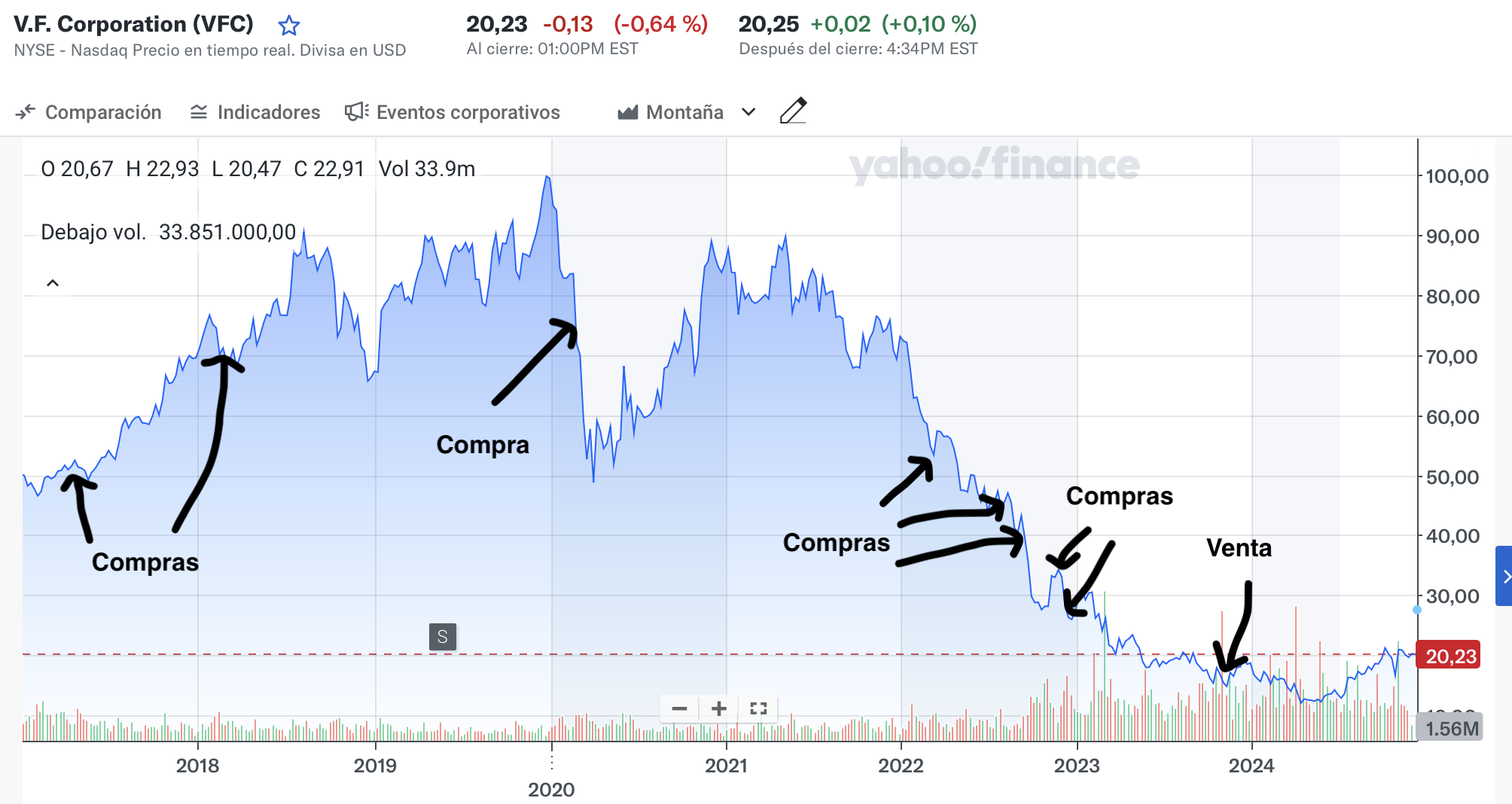
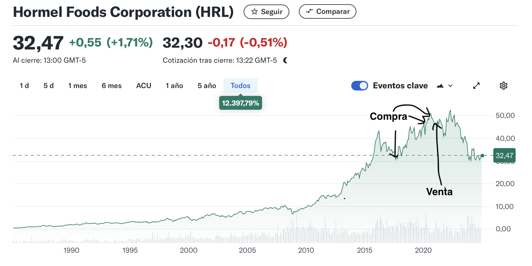
But for me is much more graphic to see a chart price of the stock that marks when I buy and when I sell.
Like These ones.
The chart does not tell me the number I would have won or lost, but it tells me about my behaviour. Do I hold until claudication always?, Should I think more about time to sell instead of follow the bad news?. Do I buy in bull or bear time?.
Don’t know if it could be feasible but and interesting feature.
I personally find up/down arrows and points to descriptive enough to figure out what is going on but I do like the idea of having an option to switch to B, S, D.
I’ve only been a user for a couple of weeks but somewhere along the way I was presented with a video guide on all the features and found it extremely useful.
I wonder if stock splits are worth noting too, when I was waiting for an entry price on NVDA, I knew the stock split would be bullish so I went in hard when that was announced.
Stock splits are marked with a cross (X), but not into the future. Capitally is not well suited for analysis like that, there are plenty of stock screeners with better data quality around future events