At the moment I’m looking at a 1m and 3m view of the market value of my asset, which has gone from around 20k to 21k. However this appears as a basically flat line right at the top of the chart because the y axis needlessly starts at zero. If the y axis started at the minimum during the period the line would show as a much more satisfying general incline!
It’s worth noting I’ve held the asset for less than 6 months, so one the 1y or ytd views the chart probably rightly does start at zero on the y axis.
All chart purists would immediately burn me in flames if the chart wouldn’t start at zero
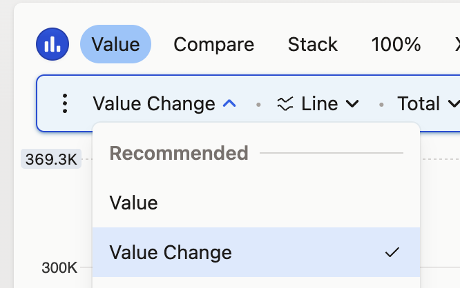
But jokes aside, all metrics apart from market value and price are displayed as change within the period, so they naturally start at 0 - that’s why I decided to simplify the interface and not include this option.
However, to see a nice incline in returns, I’d recommend looking at Returns instead of Market Value, as it isn’t skewed by your contributions/withdrawals. If you do want to see the market value, you can modify the Market value chart to display Value Change instead - it won’t be the total value, but change within the period. You’ll always see the total value on the tab above.