The allocation metric in the portfolio view is now calculated as the value of the asset divided by the total gross absolute value of all assets in the portfolio. This creates a rather non-meaningful number for the portfolio allocation % when there are short positions in that portfolio. A short position now has a positive % number of allocation because of that (instead of a negative one). In my view, a more practical depictions would for example show the long positions adding up to 105% and the short positions adding up to -5% to reach the 100% allocation in total.
Is there a shortcoming here or am I missing a good reason for the calculation functioning this way currently?
I’d find 105% allocation pretty confusing. Currently short position are indeed positive, but their bar is red to depict being short.
The idea behind it now, is how much each asset contributes to the overall picture, which is the full absolute extent of your wealth. Showing -5% would prevent it from adding up.
I understand though, that using the total ability value is “novel” and may be confusing.
Another option I was thinking about is to display allocation for short & long separately. So that all positive values add up to 100% and all negative add up to -100%.
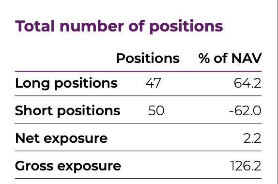
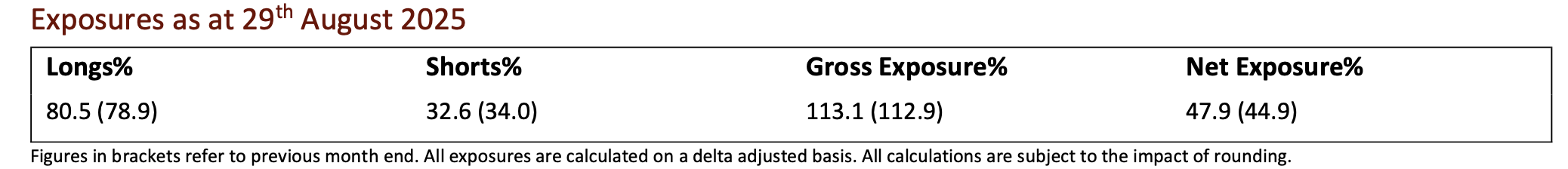
When reporting on allocation, long/short funds make the distinction between long and short exposure, gross exposure and net exposure. It’s fairly common to have exposures higher than 100% on one of these metrics, so I wouldn’t be shocked by a 105% metric personally (see two screenshots from fund factsheets below.). It would always be offset with negative cash or negative stock elsewhere to make it 100% again as you cannot allocate more than 100% of the net portfolio value without borrowing money / selling short.
But displaying short positions separately could also work!
The separate allocation % will be released in v2.23.9.
Btw, the standard approach you proposed has one flaw - if you have equal amount of assets & liabilities, your allocation ratio becomes infinite on both sides. And currently the X-Ray chart displays it that way. As you can freely slice & dice the portfolio, it’s pretty easy to bump into this scenario where it’s not that obvious what’s going on.