I’m moving over from Morningstar’s Portfolio Manager that is being shut down, and one thing I miss - and I can’t quite replicate here - is the per-month summary they have under the results chart. This one:
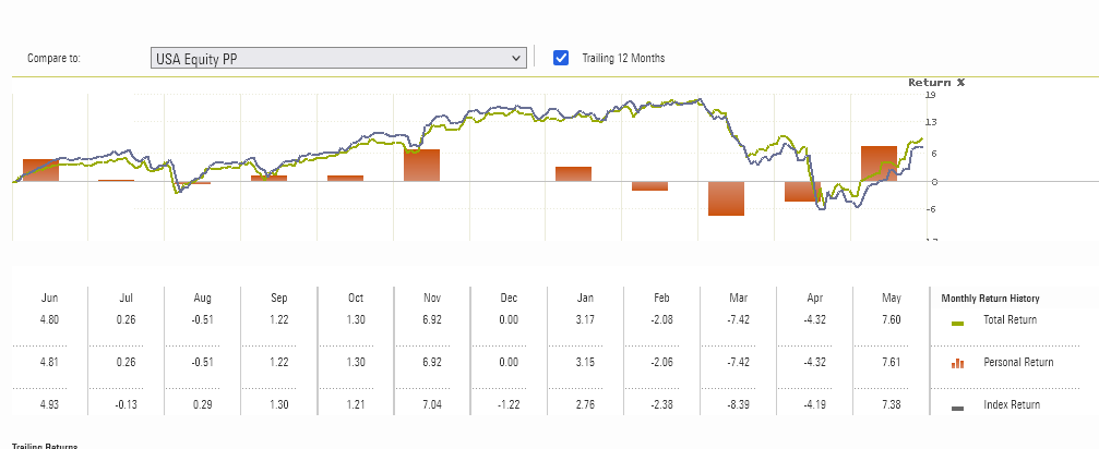
It shows the end result for each month. I was for me an easy way to present results to other family members, without exposing the daily “bumpiness” so much.
Is there a way to get this output already? I feel like I might be missing a trick, as the Summary page is quite similar, although I can only see day-to-day changes and not month-to-month on the default view.
Hmm, I think this broke yesterday or the day before (19th or 20th of May). The values lined up with Morningstar calculation, and now they're humongously wrong. Like -55% one month, +44% the next one.
– LeszekYou can switch to compare chart to see which asset (or account) is causing this
– rafalIt is showing the expected values when showing, well, asset values graphs. I'm confused. But the percentages are off.
– Leszek