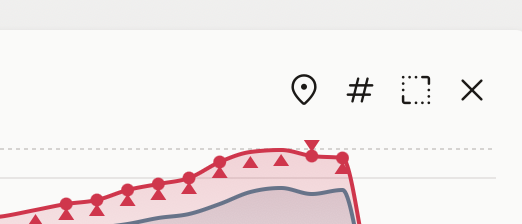
The chart buy/sell/dividends arrows to be green/red/yellow or distinctive colors

Currently the markers have the same color as the serie they’re on. I understand you propose to color them differently only on charts there’s a single serie (not comparisons).
I’m sure you can do a “magic trick” and manipulate the chart somehow. Just saying it would be nice ![]()
I mean that from the legibility perspective, if you have 5 lines of different colors, then having all markers red or green would make it harder to discern which belong to which line. So for me the only viable place is a single serie.
When thinking about new features I always try to understand why something is needed, and then try to make it compatible with other "why"s of other users.
So just to understand better - is it a visual preference, or the markers in current form are not clear enough?
It’s just that when you have many points of actions, you cannot distinguish very clear which arrow is up and which is down.
Maybe one tobe brighter (up) and darker (down) … maybe a slight different sizes. ![]()