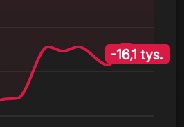
Something to consider regarding chart values. Currently labels are on top of the charts which covers part of them. Please take a look at the attached example. There’s some change in the last part of the chart, but it isn’t visible
I’d suggest to consider putting labels of the Y-axis as a part of the additional right hand side margins, so they don’t cover the chart.
It was not a bug, but a feature - to use the full width for the chart.
So I’m moving this to proposals and will think about it. Maybe a good solution would be to keep as-is on narrows screens, and add right margin on wider ones